Creating a membership based site seems like a daunting task at first. If you ever wanted to do this by yourself, then just gave up when you started to think how you are going to put it together using your PHP skills, then this article is for you. We are going to walk you through every aspect of creating a membership based site, with a secure members area protected by password.
The whole process consists of two big parts: user registration and user authentication. In the first part, we are going to cover creation of the registration form and storing the data in a MySQL database. In the second part, we will create the login form and use it to allow users access in the secure area.
Download the code
You can download the whole source code for the registration/login system from the link below:
Configuration & Upload
The ReadMe file contains detailed instructions.
Open the source\include\membersite_config.php file in a text editor and update the configuration. (Database login, your website’s name, your email address etc).
Upload the whole directory contents. Test the register.php by submitting the form.
The registration form
In order to create a user account, we need to gather a minimal amount of information from the user. We need his name, his email address and his desired username and password. Of course, we can ask for more information at this point, but a long form is always a turn-off. So let’s limit ourselves to just those fields.
Here is the registration form:
So, we have text fields for name, email and the password. Note that we are using the for better usability.
Form validation
At this point it is a good idea to put some form validation code in place, so we make sure that we have all the data required to create the user account. We need to check if name and email, and password are filled in and that the email is in the proper format.
Handling the form submission
Now we have to handle the form data that is submitted.
Here is the sequence (see the file fg_membersite.php in the downloaded source):
function RegisterUser() { if(!isset($_POST["submitted"])) { return false; } $formvars = array(); if(!$this->ValidateRegistrationSubmission()) { return false; } $this->CollectRegistrationSubmission($formvars); if(!$this->SaveToDatabase($formvars)) { return false; } if(!$this->SendUserConfirmationEmail($formvars)) { return false; } $this->SendAdminIntimationEmail($formvars); return true; }
First, we validate the form submission. Then we collect and ‘sanitize’ the form submission data (always do this before sending email, saving to database etc). The form submission is then saved to the database table. We send an email to the user requesting confirmation. Then we intimate the admin that a user has registered.
Saving the data in the database
Now that we gathered all the data, we need to store it into the database.
Here is how we save the form submission to the database.
function SaveToDatabase(&$formvars) { if(!$this->DBLogin()) { $this->HandleError("Database login failed!"); return false; } if(!$this->Ensuretable()) { return false; } if(!$this->IsFieldUnique($formvars,"email")) { $this->HandleError("This email is already registered"); return false; } if(!$this->IsFieldUnique($formvars,"username")) { $this->HandleError("This UserName is already used. Please try another username"); return false; } if(!$this->InsertIntoDB($formvars)) { $this->HandleError("Inserting to Database failed!"); return false; } return true; }
Note that you have configured the Database login details in the membersite_config.php file. Most of the cases, you can use “localhost” for database host.
After logging in, we make sure that the table is existing.(If not, the script will create the required table).
Then we make sure that the username and email are unique. If it is not unique, we return error back to the user.
The database table structure
This is the table structure. The CreateTable() function in the fg_membersite.php file creates the table. Here is the code:
function CreateTable() { $qry = "Create Table $this->tablename (". "id_user INT NOT NULL AUTO_INCREMENT ,". "name VARCHAR(128) NOT NULL ,". "email VARCHAR(64) NOT NULL ,". "phone_number VARCHAR(16) NOT NULL ,". "username VARCHAR(16) NOT NULL ,". "password VARCHAR(32) NOT NULL ,". "confirmcode VARCHAR(32) ,". "PRIMARY KEY (id_user)". ")"; if(!mysql_query($qry,$this->connection)) { $this->HandleDBError("Error creating the table \nquery was\n $qry"); return false; } return true; }
The id_user field will contain the unique id of the user, and is also the primary key of the table. Notice that we allow 32 characters for the password field. We do this because, as an added security measure, we will store the password in the database encrypted using MD5. Please note that because MD5 is an one-way encryption method, we won’t be able to recover the password in case the user forgets it.
Inserting the registration to the table
Here is the code that we use to insert data into the database. We will have all our data available in the $formvars array.
function InsertIntoDB(&$formvars) { $confirmcode = $this->MakeConfirmationMd5($formvars["email"]); $insert_query = "insert into ".$this->tablename."(name, email, username, password, confirmcode) values ("" . $this->SanitizeForSQL($formvars["name"]) . "", "" . $this->SanitizeForSQL($formvars["email"]) . "", "" . $this->SanitizeForSQL($formvars["username"]) . "", "" . md5($formvars["password"]) . "", "" . $confirmcode . "")"; if(!mysql_query($insert_query ,$this->connection)) { $this->HandleDBError("Error inserting data to the table\nquery:$insert_query"); return false; } return true; }
Notice that we use PHP function md5() to encrypt the password before inserting it into the database.
Also, we make the unique confirmation code from the user’s email address.
Sending emails
Now that we have the registration in our database, we will send a confirmation email to the user. The user has to click a link in the confirmation email to complete the registration process.
function SendUserConfirmationEmail(&$formvars) { $mailer = new PHPMailer(); $mailer->CharSet = "utf-8"; $mailer->AddAddress($formvars["email"],$formvars["name"]); $mailer->Subject = "Your registration with ".$this->sitename; $mailer->From = $this->GetFromAddress(); $confirmcode = urlencode($this->MakeConfirmationMd5($formvars["email"])); $confirm_url = $this->GetAbsoluteURLFolder()."/confirmreg.php?code=".$confirmcode; $mailer->Body ="Hello ".$formvars["name"]."\r\n\r\n". "Thanks for your registration with ".$this->sitename."\r\n". "Please click the link below to confirm your registration.\r\n". "$confirm_url\r\n". "\r\n". "Regards,\r\n". "Webmaster\r\n". $this->sitename; if(!$mailer->Send()) { $this->HandleError("Failed sending registration confirmation email."); return false; } return true; }
Updates
9th Jan 2012
Reset Password/Change Password features are added
The code is now shared at GitHub .
Welcome back UserFullName(); ?>!
License

The code is shared under LGPL license. You can freely use it on commercial or non-commercial websites.
No related posts.
Comments on this entry are closed.
In this tutorial, we are going to tell you how you can create Registration Form using HTML and CSS3. We will create two Registration forms; the first one is simple, and another one has Icons with each input field. The icons we have used are font icons. These registration forms are simple, clean and attractive.
The icons we have used are font icons. These registration forms are simple , clean code and unique in design. You can be utilized it into your website and customize it as you need.
If you are looking for more forms collection, then this 40+ beautiful sign-up forms is the best collection I found on the internet. They posted a lot of forms free and premium as well.
The signup forms used on websites to allow the site visitors to create an account and build their profile. It depends on upon you what benefit you will give to the users who register on your website.
Some site used such form to provide more access to the user such as download files or post article etc. Anyway, Let’s have a look, how we can create them.
Registration Form in HTML
Let’s start with registration form HTML code. Both forms code added inside the div class name cclogin .
For simple form, we have added class simple next to cclogin and for icon style form , we have added class icons next to cclogin .
The input fields of the form are inside the p tag. let’s have a look block of HTML code.
Let’s add some placeholders
But if you see the demo, I have to make the first name and last name fields small and fit them into one row. To make them like that we have added half class into p the tag.
As I said you before that, another Form is icon style form. In this form, we have used a similar technique which we have previously used in As you know we are using font icon so we have added it to span tag.
Forms Styling with CSS
First of all, we will take a look at style-sheet of icons. For icons, we have used:before attribute
Fa-user:before { content: "\f007"; } .fa-key:before { content: "\f084"; } .fa-envelope:before { content: "\f0e0"; }
Let’s see styling of the fields
Cclogin input, .cclogin input, .cclogin select{ padding:10px; width:100%; border:none; height:50px; line-height:50px; color:#757575; }
The form fields without icons have 100% width, but for the fields without have 92% width, this is because we require space to add icons before the input fields.
To make the fields small, we just have added class .half into p the tag and set it’s width to 48%. For second field we have added .last class next to .half class so we can make the margin-right:0%; in the CSS.
Cclogin .half { float: left; width: 48%; margin-right:4% } .cclogin .half.last{ margin-right:0%; }
The icons used in the demo are from the Font Awesome set by Davegandy and they are licensed under the CC BY 3.0 license. Hope you enjoy this CSS3 user register Form. Leave the comment to let us know.
We will style it using CSS3 and an icon font. The idea behind this demo is to show the user the login form and provide a link to “switch” to the registration form.
Note that this is for demo purpose only, it will only work in browser supporting the:target pseudo class, and you should not use this code on a live website without providing solid fallback.
In the following, we will be going through Demo 1.
The HTML
In the HTML, we will put both forms, hiding the second one with CSS. Here is the code, I’ll explain some of the interesting parts later.
We’ve added some HTML5 goodness here and used some of the new inputs. The input type=password
automatically hides what the user is typing and replaces it with dots (depending on browser). The input type=email
enables the browser to check if what the user entered has the format of a valid email address. We’ve also used the require=required
attribute; browsers that support this attribute will not let the user submit the form until this field is filled, no JavaScript required.
The autocomplete=on
attribute will prefill values based on earlier user input. We also used some nice placeholders for the inputs that will show some guiding value when the input is not filled.
Now the two tricky parts. You might have noticed the two links at the top of the form. This is a little trick that will make our form behave nicely when playing with anchors, so that it won’t “jump” on long pages when we click on the switching link and trigger the:target pseudo-class.
The second little trick is related to the use of the icon font. We will be using a data-attribute to display the icons. By setting data-icon=”icon_character” with the according character in the HTML we will just need one CSS attribute selector to style all the icons. Read more about this technique on 24 Ways: Displaying Icons with Fonts and Data- Attributes .
The CSS
For the clearness of the code in this tutorial, I will omit all the vendor prefixes, but you will, of course, find them in the files. Once again, I’m using some pretty advanced CSS3 tricks that might not work in all browsers. Let’s get started.
Styling both forms using CSS3
First, let’s give our two forms some general styling for the container.
#subscribe, #login{ position: absolute; top: 0px; width: 88%; padding: 18px 6% 60px 6%; margin: 0 0 35px 0; background: rgb(247, 247, 247); border: 1px solid rgba(147, 184, 189,0.8); box-shadow: 0pt 2px 5px rgba(105, 108, 109, 0.7), 0px 0px 8px 5px rgba(208, 223, 226, 0.4) inset; border-radius: 5px; } #login{ z-index: 22; }
We’ve added a nice box shadow that’s made of two shadows: an inset one to create the inner blue glow, and an outside shadow. We’ll explain the z-index in a bit.
In the following we will style the header with some background clipping:
/**** general text styling ****/ #wrapper h1{ font-size: 48px; color: rgb(6, 106, 117); padding: 2px 0 10px 0; font-family: "FranchiseRegular","Arial Narrow",Arial,sans-serif; font-weight: bold; text-align: center; padding-bottom: 30px; } /** For the moment only webkit supports the background-clip:text; */ #wrapper h1{ background: -webkit-repeating-linear-gradient(-45deg, rgb(18, 83, 93) , rgb(18, 83, 93) 20px, rgb(64, 111, 118) 20px, rgb(64, 111, 118) 40px, rgb(18, 83, 93) 40px); -webkit-text-fill-color: transparent; -webkit-background-clip: text; } #wrapper h1:after{ content:" "; display:block; width:100%; height:2px; margin-top:10px; background: linear-gradient(left, rgba(147,184,189,0) 0%, rgba(147,184,189,0.8) 20%, rgba(147,184,189,1) 53%, rgba(147,184,189,0.8) 79%, rgba(147,184,189,0) 100%); }
Note that at this moment only webkit browsers support background-clip: text , so we will create a stripped background only for webkit here, and clip it to the text to add the stripes to the H1 title. Since the background-clip: text property currently only works in Webkit browsers, I decided to go only with the webkit prefix. That’s the reason why I split the CSS declaration into two parts, and use a webkit prefixed gradient only. Only using the –webkit- prefix is bad practice, it’s only for demo purpose, and you should never do this on real a website! That’s also where the -webkit-text-fill-color: transparent comes in handy: it enables us to only have a transparent background on the webkit browsers, all the other ones will ignore it and give us the provided text color fallback.
We also created a fading line under the title with the help of the:after pseudo-class. We use a 2px height gradient and fade the background to 0 opacity at both ends.
Now let’s style our inputs and give them a nicer look.
/**** advanced input styling ****/ /* placeholder */ ::-webkit-input-placeholder { color: rgb(190, 188, 188); font-style: italic; } input:-moz-placeholder, textarea:-moz-placeholder{ color: rgb(190, 188, 188); font-style: italic; } input { outline: none; }
First we style the inputs, and remove the outline. But be careful here; the outline helps the user know which input is focused, so if you remove it, you should provide some:active and:focus states for the inputs.
/* all the input except submit and checkbox */ #wrapper input:not(){ width: 92%; margin-top: 4px; padding: 10px 5px 10px 32px; border: 1px solid rgb(178, 178, 178); box-sizing: content-box; border-radius: 3px; box-shadow: 0px 1px 4px 0px rgba(168, 168, 168, 0.6) inset; transition: all 0.2s linear; } #wrapper input:not():active, #wrapper input:not():focus{ border: 1px solid rgba(91, 90, 90, 0.7); background: rgba(238, 236, 240, 0.2); box-shadow: 0px 1px 4px 0px rgba(168, 168, 168, 0.9) inset; }
Here we used the:not pseudo class, to style all inputs, except the checkbox. I provided a:focus and:active state, since I decided to remove the outline.
And now the fun part: the icon font. Since we can’t use:before and:after pseudo classes on inputs, we’ll have to cheat a little bit: we’ll add the icon to the label, and then place it in the input. I’m using the fontomas library which puts together some nice icons. You can rearrange them to set the icon to a specific letter. Remember the data-icon attribute? It’s where you should put the letter. I used data-icon=’u’ for user, ‘e’ for email, ‘p’ for password. Once I chose the letters, I downloaded the font, and used the fontsquirrel font generator to transform it into a @font-face compatible format.
@font-face { font-family: "FontomasCustomRegular"; src: url("fonts/fontomas-webfont.eot"); src: url("fonts/fontomas-webfont.eot?#iefix") format("embedded-opentype"), url("fonts/fontomas-webfont.woff") format("woff"), url("fonts/fontomas-webfont.ttf") format("truetype"), url("fonts/fontomas-webfont.svg#FontomasCustomRegular") format("svg"); font-weight: normal; font-style: normal; } /** the magic icon trick ! **/ :after { content: attr(data-icon); font-family: "FontomasCustomRegular"; color: rgb(106, 159, 171); position: absolute; left: 10px; top: 35px; width: 30px; }
Yeah, that’s it folks, you don’t need to have a class for each icon. We used content: attr(data-icon) to retrieve the letter from the data-icon attribute, so we only have to declare the font, choose a nice color and position it.
Now let’s style the submit button for both forms.
/*styling both submit buttons */ #wrapper p.button input{ width: 30%; cursor: pointer; background: rgb(61, 157, 179); padding: 8px 5px; font-family: "BebasNeueRegular","Arial Narrow",Arial,sans-serif; color: #fff; font-size: 24px; border: 1px solid rgb(28, 108, 122); margin-bottom: 10px; text-shadow: 0 1px 1px rgba(0, 0, 0, 0.5); border-radius: 3px; box-shadow: 0px 1px 6px 4px rgba(0, 0, 0, 0.07) inset, 0px 0px 0px 3px rgb(254, 254, 254), 0px 5px 3px 3px rgb(210, 210, 210); transition: all 0.2s linear; } #wrapper p.button input:hover{ background: rgb(74, 179, 198); } #wrapper p.button input:active, #wrapper p.button input:focus{ background: rgb(40, 137, 154); position: relative; top: 1px; border: 1px solid rgb(12, 76, 87); box-shadow: 0px 1px 6px 4px rgba(0, 0, 0, 0.2) inset; } p.login.button, p.signin.button{ text-align: right; margin: 5px 0; }
The trick here is to use the box-shadow in order to create some extra borders. You can only use one border, but as many box-shadows as you want. We will use the length value to create a “fake” second white border, 3px wide, with no blur.
Then we’ll style the checkbox, nothing very special here:
/* styling the checkbox "keep me logged in"*/ .keeplogin{ margin-top: -5px; } .keeplogin input, .keeplogin label{ display: inline-block; font-size: 12px; font-style: italic; } .keeplogin input#loginkeeping{ margin-right: 5px; } .keeplogin label{ width: 80%; }
We will style the bottom of the form using repeating linear gradients to create a striped background.
P.change_link{ position: absolute; color: rgb(127, 124, 124); left: 0px; height: 20px; width: 440px; padding: 17px 30px 20px 30px; font-size: 16px ; text-align: right; border-top: 1px solid rgb(219, 229, 232); border-radius: 0 0 5px 5px; background: rgb(225, 234, 235); background: repeating-linear-gradient(-45deg, rgb(247, 247, 247) , rgb(247, 247, 247) 15px, rgb(225, 234, 235) 15px, rgb(225, 234, 235) 30px, rgb(247, 247, 247) 30px); } #wrapper p.change_link a { display: inline-block; font-weight: bold; background: rgb(247, 248, 241); padding: 2px 6px; color: rgb(29, 162, 193); margin-left: 10px; text-decoration: none; border-radius: 4px; border: 1px solid rgb(203, 213, 214); transition: all 0.4s linear; } #wrapper p.change_link a:hover { color: rgb(57, 191, 215); background: rgb(247, 247, 247); border: 1px solid rgb(74, 179, 198); } #wrapper p.change_link a:active{ position: relative; top: 1px; }
Now you’ll notice that we’ve got two nice forms, but we really want only one to show at a time. So now is time for some animations!!
Creating the switching animation
The first thing to do is to hide the second form by setting the opacity to 0:
#register{ z-index: 21; opacity: 0; }
Remember that our login form had a z-index of 22? We will give the second form a z-index of 21, to put it “under” the login form.
And now the really good part: switching the forms using the:target pseudo class. What you really have to understand about:target, is that we will use anchors to make the transition. The normal behavior of an anchor link, is to jump to the target in the page. But we don’t want to jump anywhere, we only want to switch the forms. And here comes our trick using the two links at the top of the page. Instead of directly linking to the second form, and risking getting a “jumping” effect, we actually put the two links at the top of the page and give them display: none . This will avoid any page jump. Credit where credit’s due: I found this trick on CSS3 create (in French).
#toregister:target ~ #wrapper #register, #tologin:target ~ #wrapper #login{ z-index: 22; animation-name: fadeInLeft; animation-delay: .1s; }
So this is what happens: when we click on the Join us
button, we trigger the #toregister. We then do the animation, by using the sibling selector ~ to find our #register element. We use an animation called fadeInLeft
. Since we “hide” the form using zero opacity, we will use an animation that fades in, to make it appear. We’ve also changed the z-index, to make it appear on top of the other form.
The same happens for the other form.
And here is the code for the animation. We are using the CSS3 animation framework from Dan Eden and adapted it for this tutorial.
Animate{ animation-duration: 0.5s; animation-timing-function: ease; animation-fill-mode: both; } @keyframes fadeInLeft { 0% { opacity: 0; transform: translateX(-20px); } 100% { opacity: 1; transform: translateX(0); } }
The form that is “disappearing” will have another animation which will make it fade out to the left:
#toregister:target ~ #wrapper #login, #tologin:target ~ #wrapper #register{ animation-name: fadeOutLeftBig; } @keyframes fadeOutLeft { 0% { opacity: 1; transform: translateX(0); } 100% { opacity: 0; transform: translateX(-20px); } }
You can now use other animations from Dan Eden’s animate.css: just adjust your .animate class and replace the animation names. You will also find some custom animations at the end of the animate-custom.css file.
Well, that’s it folks. I hope you enjoyed the tutorial!
Please note, that in some browsers background-clip: text is not supported. In Internet Explorer 9 the transitions and animations don’t work, so there will be no fancy form switching. In Internet Explorer 8 and below the:target pseudo-class is not supported, so it won’t work at all (you’ll just see the login form).
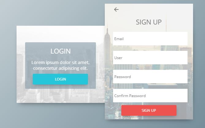
With the revolution in the concept of web page design and maintaining, to develop a closer relationship with one visiting your page is important. The viewer may be in need of using it other times, on the other hand you get active visitors for your web page. Here the concept of sign in form and registration form pups up. Firstly, after having a look over the importance, we will approach with better way to insert some Beautiful HTML CSS Sign Up and Registration Form over your web page.
While surfing over internet, you come across the ready to use sign up forms. These forms ask the details of user like name, address, email Id, Photo, gender, job including biography. The sign up forms includes username and password as basic elements. Some of these components may vary as per the form you select but basic idea is to verify the identity of your user and develop better link with them.
Among many HTML, CSS forms over internet we have listed down some best one in terms of their compatibility, flexibility and space occupied. These will be of great help for you.
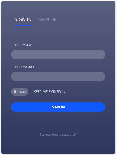
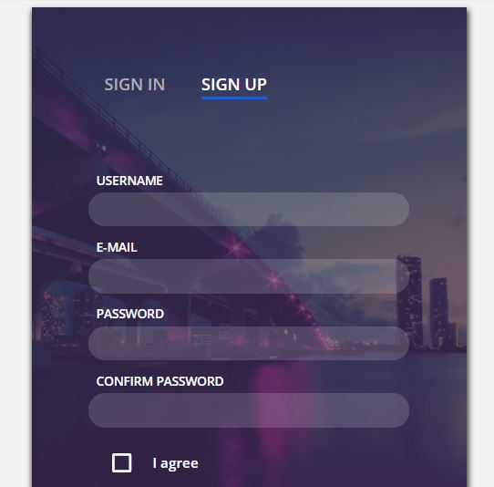
This full page, responsive CodePen is the creation of Dany Santos. The login forms only contain email and password whereas sign in form contains email, username and password. In addition these components only appear once you choose whether to log in or sign up. With the background animation this one looks attractive.

Similar to the first one this is also the CodePen by Eric whereas the component of forms is also similar. But, here the component appears in the same page so you don’t have to initially select to view the components. But admit the fact that with the plain background this one is less attractive but is flexible and light weighted.

This is simple looking registration form including plenty of examples. It is easily compatible with windows and androids as well. Moreover, designers himself have separated the forms in different categories like mini, labels in top, validity and so on. This is interactive and user friendly form example by tutorialzine.
Download and Demo

Jose Carnerioover made this simple and light weighted form by Jose over CodePen featuring to collect large number of information. It includes gender, date of birth and payment option including credit card number beside the basic one i.e. email and password. So this is best designed for online shopping and marketing.
Code and Demo
This compatible user friendly code for sign in and sign up form is the design of Josh Sorosky. It has a simple look and coded with HTML, CSS and JavaScript. Sign up Screen Animation only contain the basic things like username and password including email for sign up form.
Code and Demo
This attractive and beautiful log in and registration form is the creation of Grandvincvcent Marion. With the beautiful background picture and just basic component on forms this is actually popular with thousands of views. This is well flexible allowing easy modification and is a attractive one.
Material design log in sin up form is simple and extremely light weighted form by Brawada over CodePen. This composes of HTML, CSS and JavaScript codes and looks simple and beautiful. It just includes the basic component of forms and uses less space of your web page.
Download and Code

This is interactive, beautiful code by Kyle Lavery. Its simplicity makes it popular with, many thousand of view. Furthermore material Design Signup Interaction contains just basic component of forms but you can easily add up newer one as this is highly flexible. This is simple registration form over CodePen.
Code and Demo

Martin Machycek is popular developer in CodePen. He designed this very simple and good looking sign up and login form through HTML, CSS and JavaScript. In addition it is compatible and light weighted which is the best aspect of this form. It just included email and Password so better useful for simple WebPages then commercial one.
View Code and Demo
Sign in and Sign up – Single Form

This is interactive light weighted sign in and sign up forms by Dany Santos over CodePen. It is simple with just email and password so not well designed for commercial purpose. Because of its less weight and simple nature it has collected few thousand of view making it the attractive one.

This is interactive sign up form by Matthew Largent. Not only email and password but it also includes other personal information like age interest and biography. So this is useful for commercial sites and job searching sites. Moreover it has only HTML and CSS code, however is the useful one.
Code and Demo

This is the attractive sign up form by Kov Jonas. Moreover it provides with easy linkage with social media used by viewers. Furthermore this facility makes a frequent link u with viewers and furthermore even helps in advertisement of pages over social media. With the beautiful background image in addition to flexibility, it is well preferred.
View Code and Demo

This is extremely simple and light login form coded with HTML5 and CSS3. This is design of Aigars Silkans. It only included username and password so best designed for informative personal blogs and small websites. Fact that this has maximum number of views unlike some other CodePen is convincing.
Live Demo and Code

This beautiful sign up form is the creation of Momciloo Popov. Along with the simple components of a form it furthermore has an image side by that moves with the touch. It included all HTML, CSS and JavaScript codes.

Last but not the least, Sign up Daily UI is best login form for mobile phone by Gabrielle wee over CodePen. Moreover, it looks attractive with the background image and animation can easily replace that image. It just includes name, email and password.
Conclusion
Initially we know, among many aspects of your web page, registration and sign up follows the first order. This creates the profile of each user and moreover leads to better user management systems. In the first pace, HTML is the building block of everything and CSS makes things look attractive. So, HTML and CSS sums up making a beautiful HTML CSS Sign Up and Registration Form for your web page.
Here is an example of Registration form using HTML. Here a programmer can display as many "Text Field" as he/she wants. The name in front of Text Field is called "Label". At the end of the registration form their is a "ADD" button behnd which any desired link can be used. Once clicked it will redirect to that particular destination.
Here is an example of Registration form using HTML. Here a programmer can display as many "Text Field" as he/she wants. The name in front of Text Field is called "Label". At the end of the registration form their is a "ADD" button behnd which any desired link can be used. Once clicked it will redirect to that particular destination.HTML Code for registration form
Here is an example of Registration form using HTML. Here a programmer can display as many "Text Field" as he/she wants. The name in front of Text Field is called "Label". At the end of the registration form their is a "ADD" button behnd which any desired link can be used. Once clicked it will redirect to that particular destination.
In this example we have shown 9 "Text Field". Size of the Text Box can also be changed as per the requirement.
registration.html
 Новогодние торты – оригинальные идеи оформления десертов в новогоднем стиле!
 Толкование сна шнурки в сонниках Снилось белый шнурок
 Котенковские чтения Награды и звания